
Identity Design
Seattle SuperSonics
Brand Identity Concept
Spec Project / Quarternative 2025
The Brief
With the NBA formally moving toward expansion and Seattle widely considered the frontrunner for a new franchise, the question became inevitable: what should the SuperSonics look like when they come home? This spec project attempts to answer that, not with nostalgia, but with a fully realized identity system rooted in the cultural, geographic, and mythological DNA of the Pacific Northwest.
The Starting Point
The name SuperSonics was born from Boeing's supersonic transport program, the 2707 SST, a jet that promised to redefine air travel and was never built. A ghost aircraft. A Seattle dream that never flew. That origin story felt like the right place to start, a city defined by aerospace ambition, technological innovation, and the particular grief of something taken away before its time.
The SR-71 Blackbird entered the conversation early. Its silhouette, that long predatory taper, the extreme delta sweep, the otherworldly flatness, is arguably the most iconic jet profile ever designed. More importantly it already looks like a bird of prey. Nature and engineering arriving at the same answer.
The Pivot — Why the Thunderbird
The SR-71 reference was strong but it pointed somewhere deeper. The Pacific Northwest has its own supersonic being, one that existed in this landscape thousands of years before Boeing, before basketball, before Seattle was a city.
The Thunderbird is a supernatural figure in the traditions of the Coast Salish, Haida, Tlingit, and other Indigenous peoples of the Pacific Northwest. It creates thunder by beating its wings. It produces lightning by opening and closing its eyes. It is a being of pure electrical energy, capable of carrying whales from the ocean and battling sea serpents in the sky. It is, in the oldest stories of this region, a sonic boom made flesh.
The name SuperSonics doesn't just reference a jet. It references this, a creature whose entire mythology is built around the same energy the team was named for.
Using the Thunderbird as the foundation of this identity isn't appropriation, it's acknowledgment. It's recognizing that the most powerful symbol for a team called the SuperSonics was already here, already embedded in the land the team plays on, long before the franchise existed.
The design language draws on Northwest Coast formline art, the ovoid forms, the interlocking geometry, the bilateral structure of traditional Indigenous visual systems, without directly replicating sacred imagery. The goal is cultural resonance, not costume.
The Mark
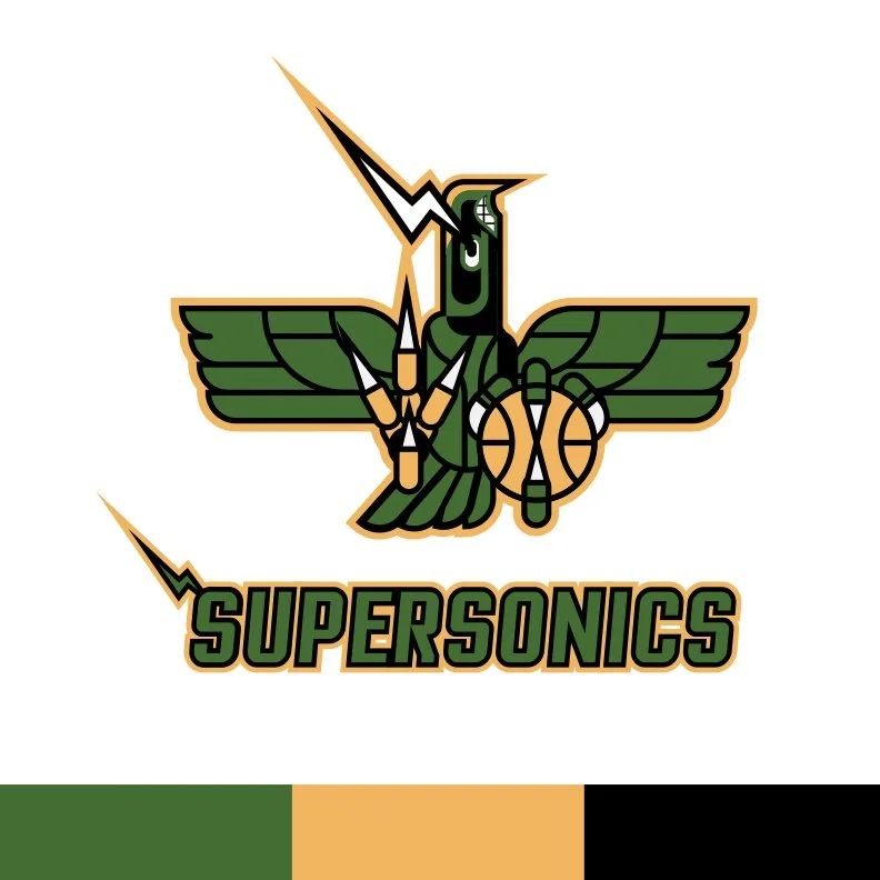
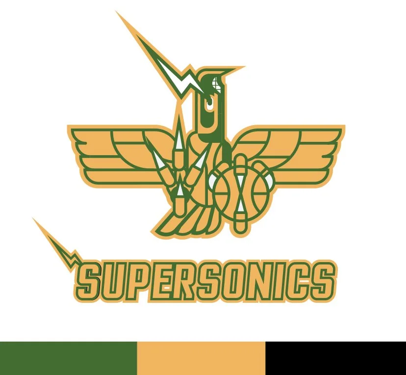
The primary mark fuses the Thunderbird with the SR-71 Blackbird silhouette. Viewed from above, the jet's fuselage becomes the bird's body. The extreme delta wing sweep becomes spread wings. The needle nose becomes the beak. The mark is designed to be read as either simultaneously, bird first for those who feel the mythology, jet first for those who feel the aerospace heritage.
Key details:
The eye — rendered as a formline ovoid with a lightning bolt as the pupil. In Thunderbird mythology, the eyes produce lightning. In the mark, the eye is the source of the bolt that extends outward from the head.
The teeth — a shark mouth borrowed from WWII nose art tradition. Aggressive, historical, grounded in aviation culture.
The claws — asymmetric, one open and raking, one gripping the basketball. The basketball is not an afterthought, it is what the Thunderbird holds, what it owns.
The sonic boom rings — reserved for the motion version, where they expand outward from the mark on impact.
The Secondary Mark
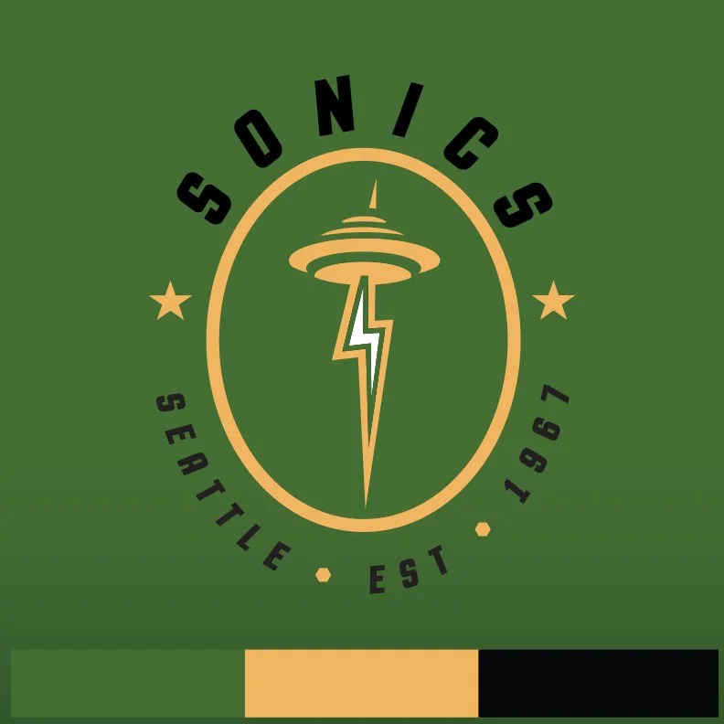
The Space Needle badge takes the lightning bolt concept further. The bolt becomes the tower itself, the entire shaft of the Space Needle is a lightning bolt, with the observation disc sitting on top and the iconic tripod legs below. The bolt doesn't just reference the Thunderbird, it makes the Space Needle itself an electrical conductor, a transmitter of sonic energy.
The badge format: circle, SONICS arched at top, SEATTLE • EST • 1967 at the bottom with lightning bolt separators. 1967 is not just a founding date — for Seattle fans it carries weight. It says we were here first.
The Motion Logo
The bolt strikes. The mark assembles. Sonic boom rings expand and fade. The background shifts from forest green to black on impact, the power going out, the lightning taking everything. Then the green returns and the mark sits, complete.
The Illustration
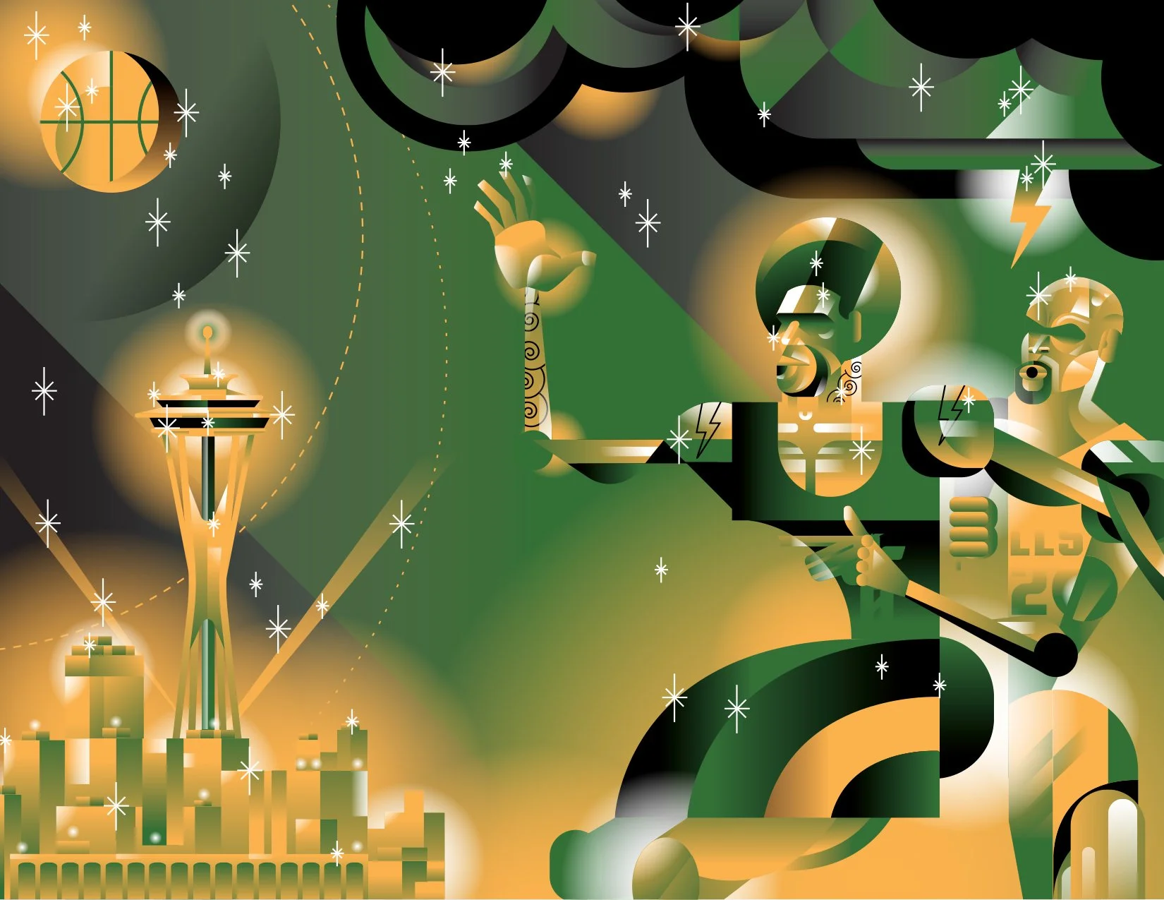
ThunderHead — a landscape illustration depicting two giant figures in a post-up battle on top of the Space Needle, a thunderstorm building behind them, the basketball rendered as the moon rising over Seattle. The city is impossibly far below. The scale is mythological. These are not basketball players, they are forces of nature playing a game in the clouds while the city watches from the ground.
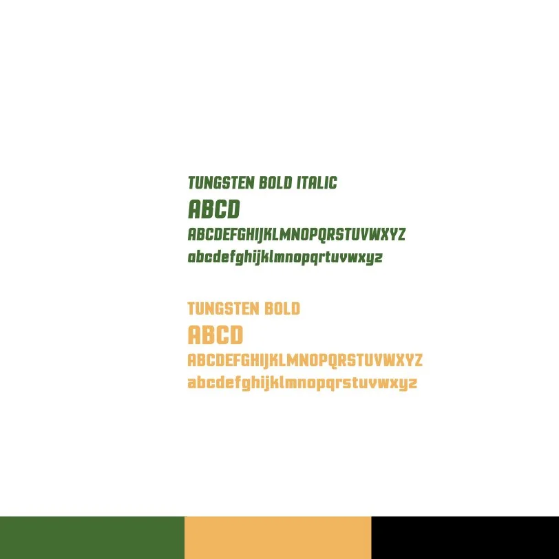
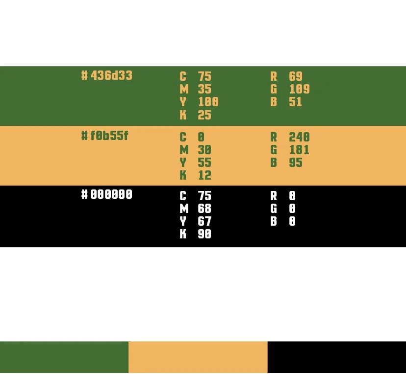
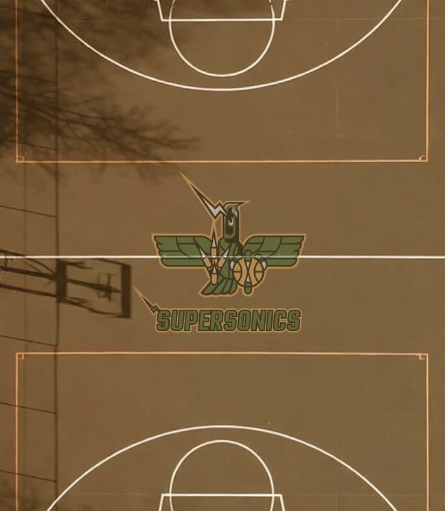
Court Identity Primary mark at center
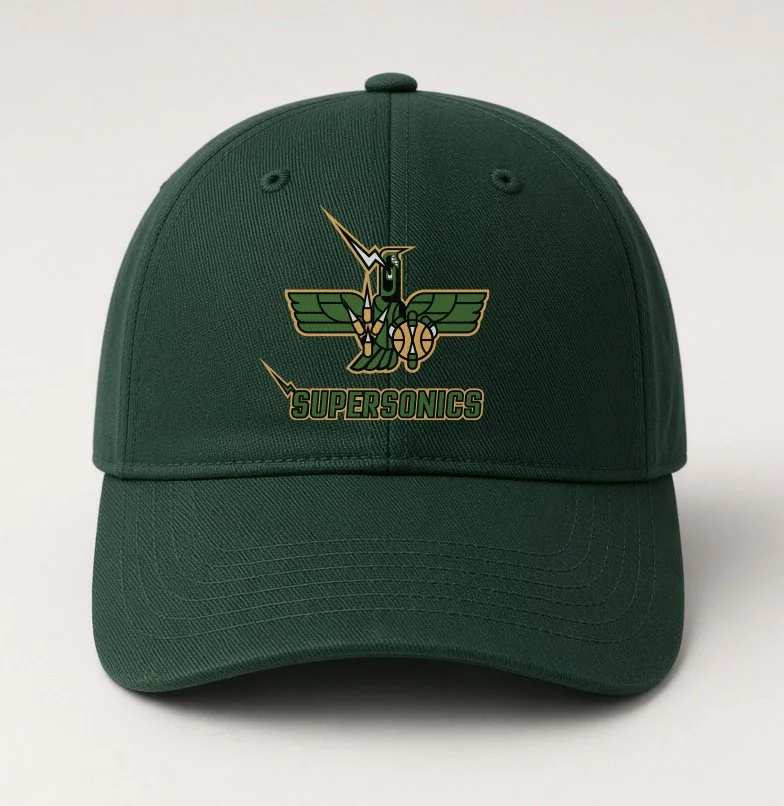
The fitted forest green baseball cap
Olde Kensington Beer
Kensington has a story worth telling. Not the one that dominates the headlines, but the one lived by the people who never left — the ones who show up, put in the work, and crack open a cold one at the end of the day.
Olde Kensington Beverage is a spec branding project rooted in the idea of neighborhood revitalization through a positive lens. In a city like Philadelphia, beer isn't just a product — in neighborhoods like Kensington it's a form of hard-earned celebration.
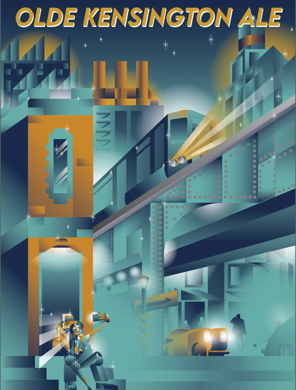
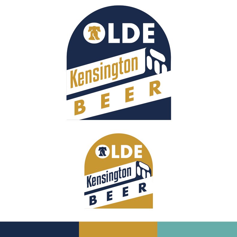
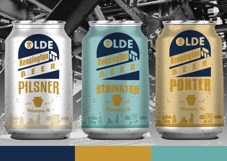
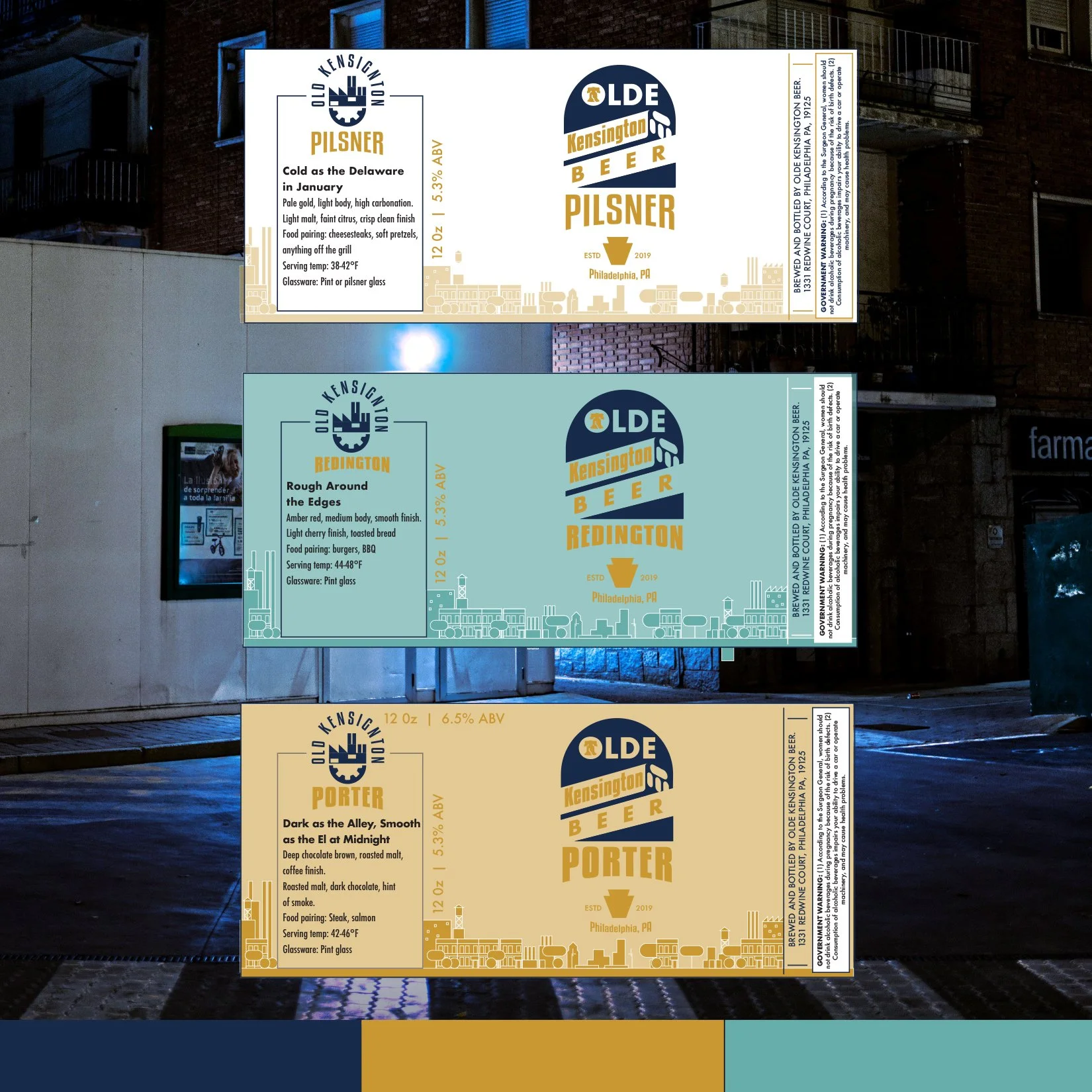
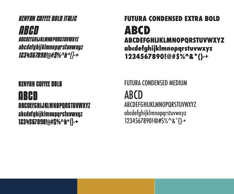
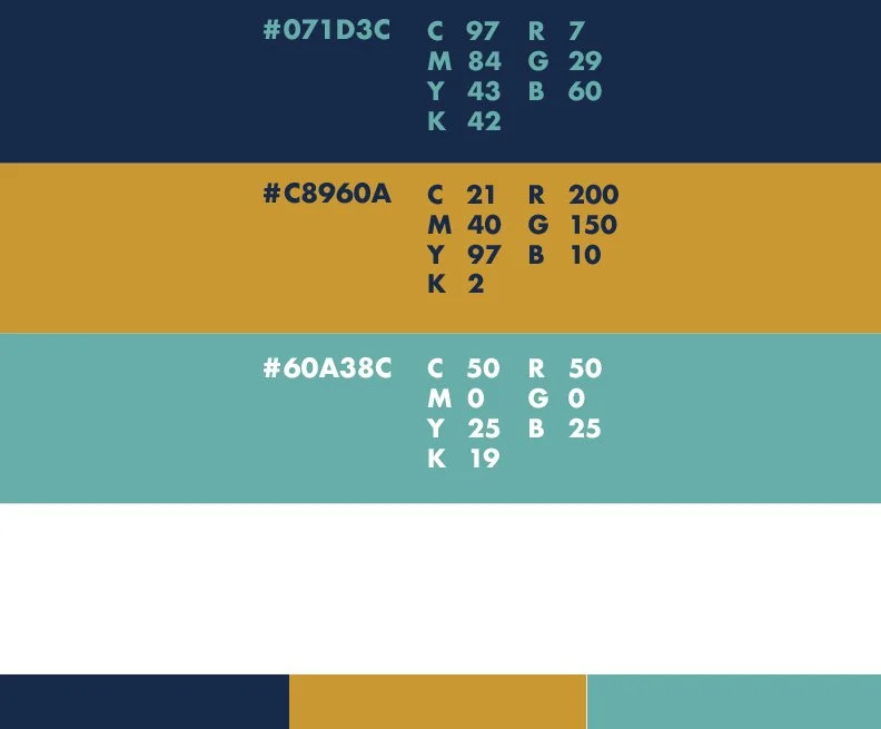
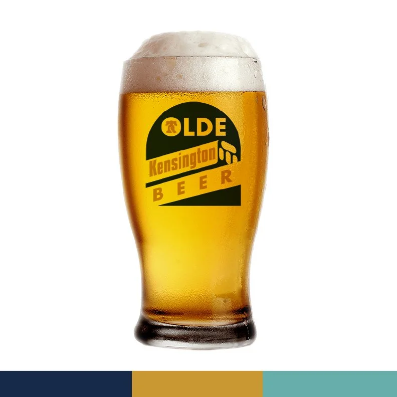
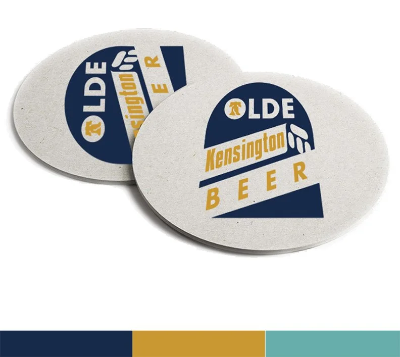
The Market-Frankford El is the visual backbone of the brand. It's the avatar of Kensington — constant, elevated, unmistakable. A minimalist approach keeps the focus squarely on the logo and identity system, letting the mark do the heavy lifting across packaging, motion, and brand collateral.
The result is a brand that feels rooted in place without being defined by its struggles — a celebration of what the neighborhood is, and what it's becoming.

blue bee cafe
Logo Development
Original Logo Circa 1974
Logo Development

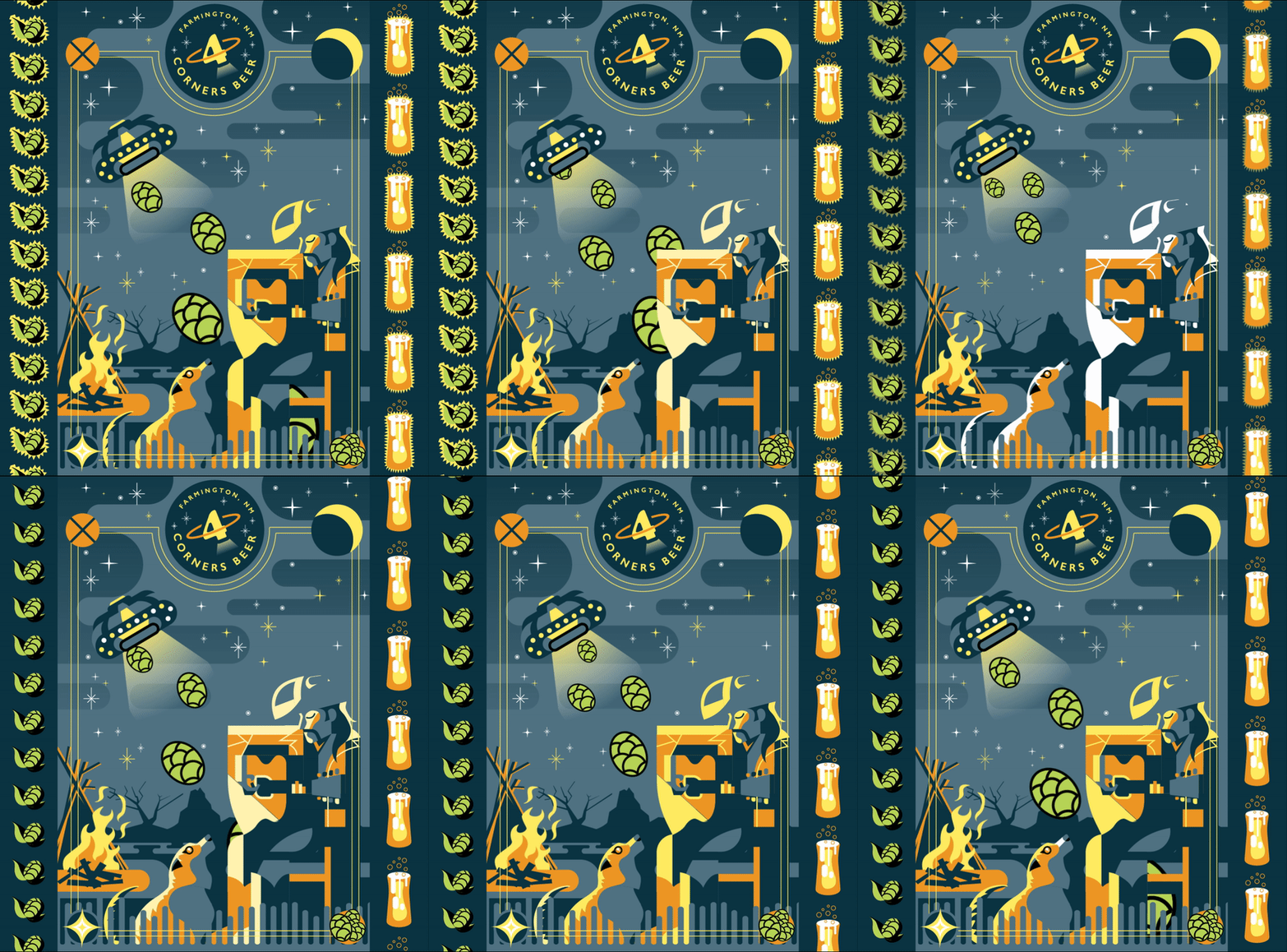


4 Corners Brewery
Brand Identity/Logo Design and Illustration
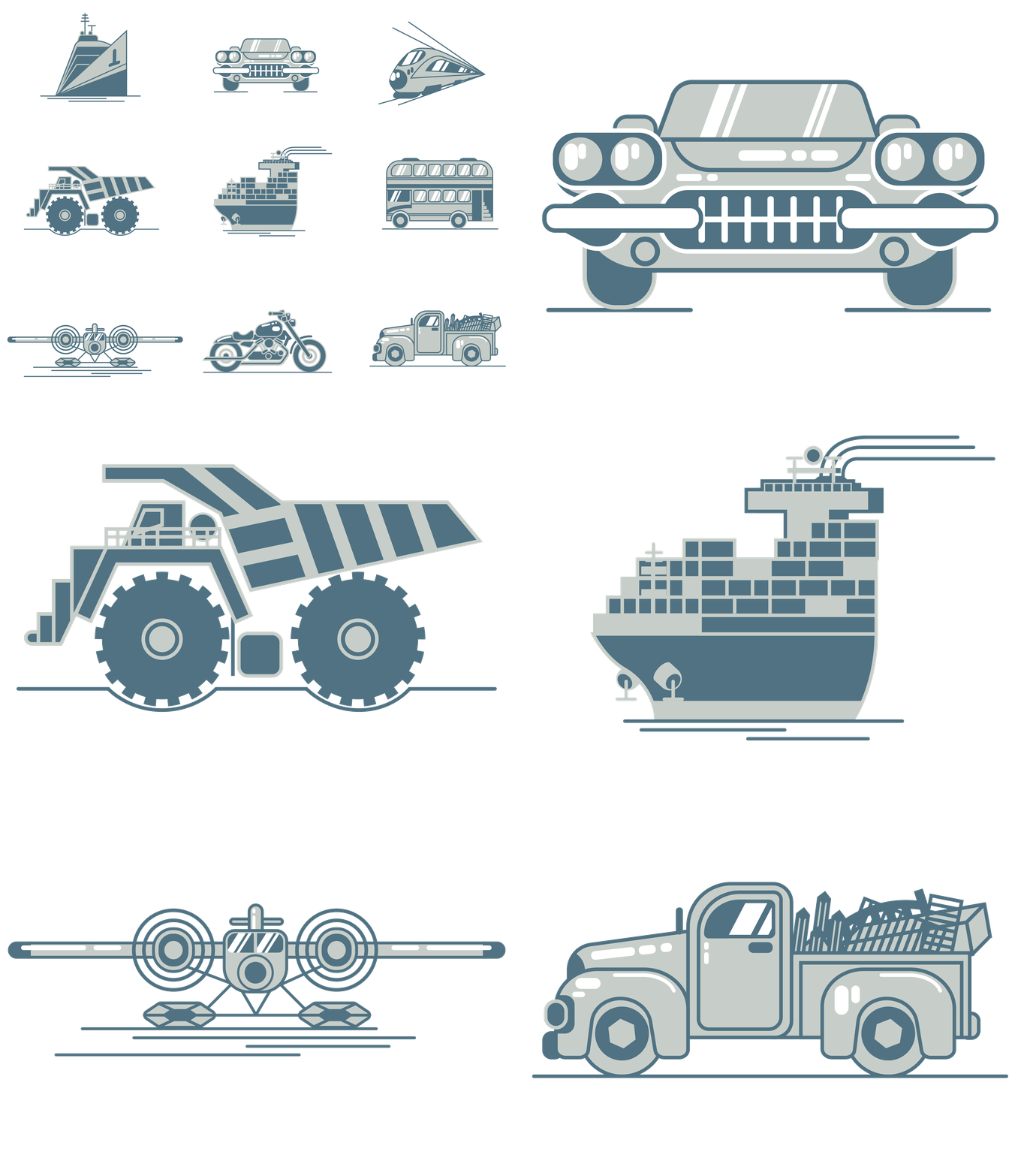
Troemner LLC
Icon Design
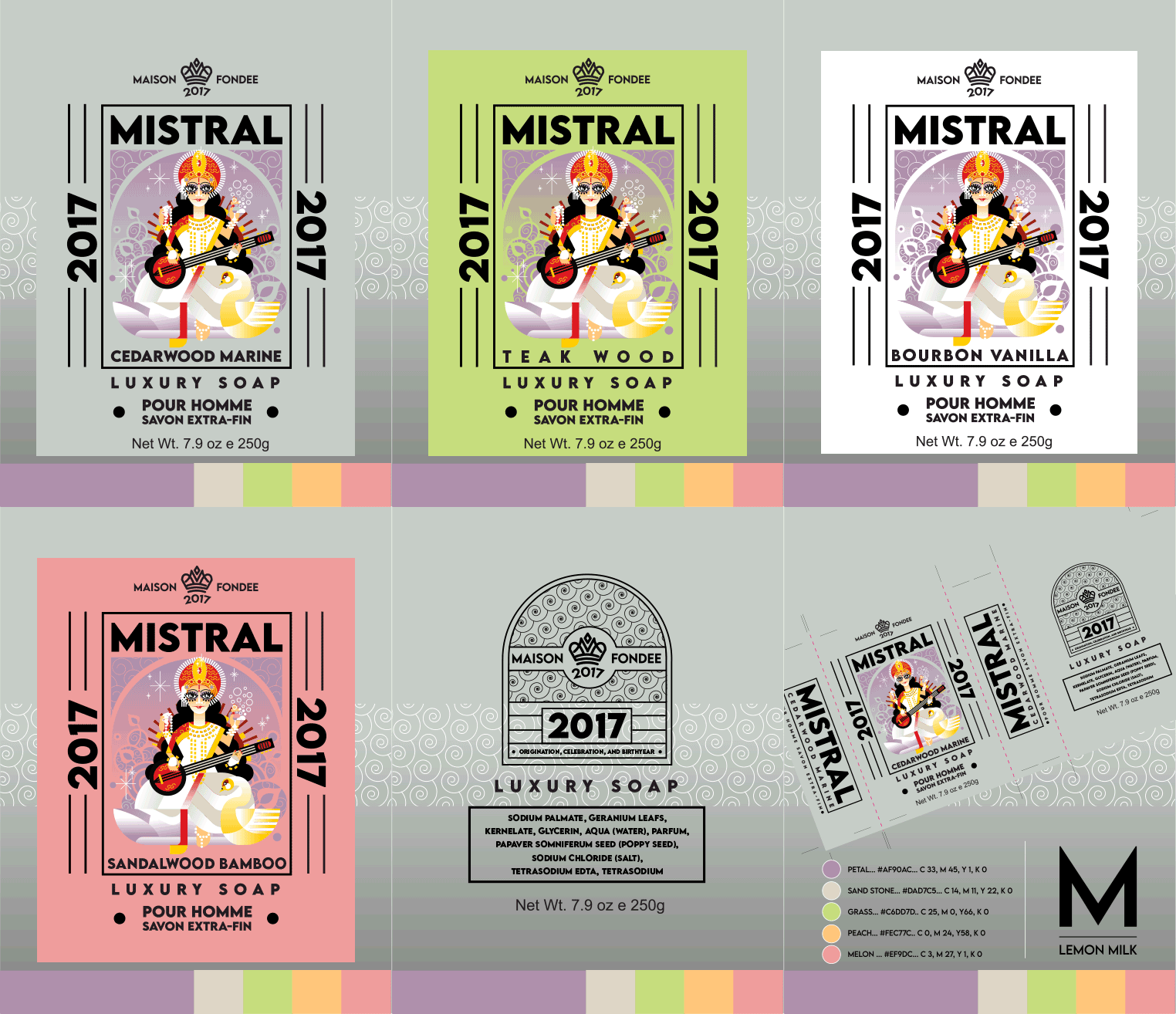
Mistral Luxury Soap
Brand Design/Package Design
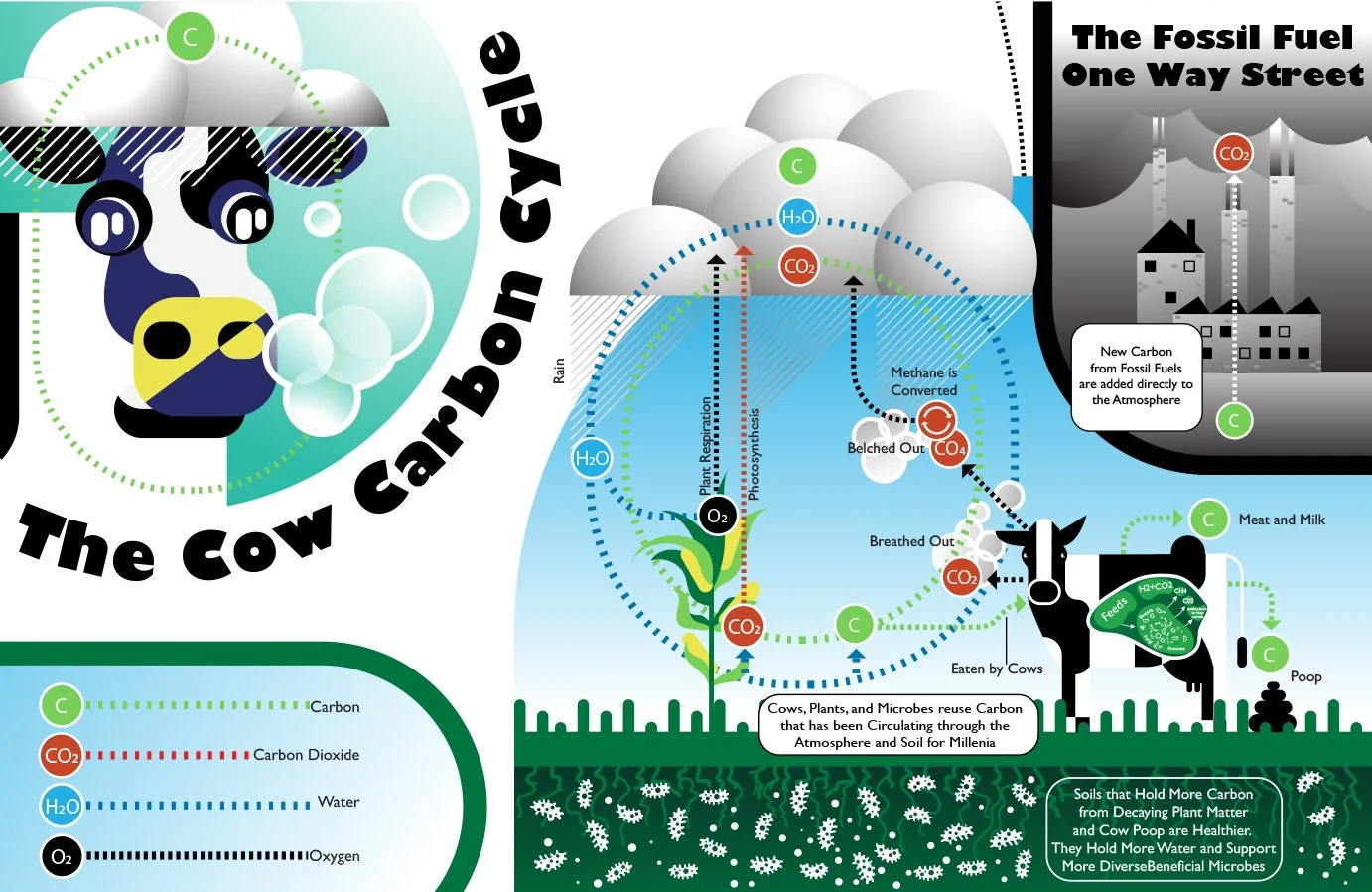
Colorado State Cow Carbon Cycle
Educational Infographics

Lemon Chocolate
Cargill Candy Package/Brand Design